Audience: client administrators and event administrators. Applies to: plans that include the registration form builder. If the Website items show a padlock in the menu, they aren't in your plan.
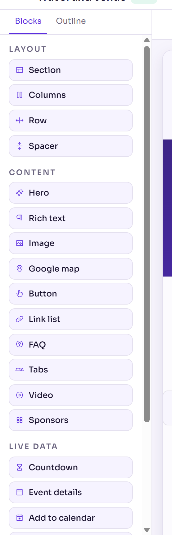
Every page of your event website is built from blocks in the page builder. This article lists each block on the Blocks tab: what it's for and its main settings. To add and arrange blocks, see Build a page with the page builder.
How blocks work
Add a block by selecting it on the Blocks tab, or drag it onto the page. Content blocks go into a Section for you.
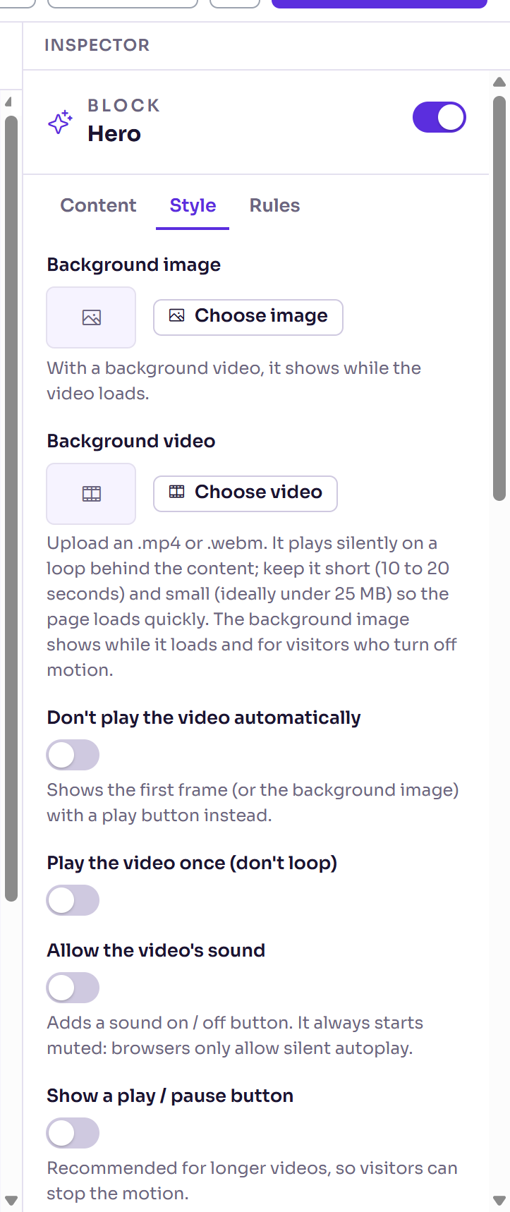
Select a block on the page or on the Outline tab to change it in the Inspector. Its settings are on three tabs:
Content: the block's text, images, links and options, listed in the tables in this article.
Style: the block's own look, then Layout, which every block has: Background, Text colour, Space above, Space below, Inner padding, Minimum height, Content width and Alignment. Colours come from your theme.
Rules: the Audience. Everyone sees the block, or choose Only these registration types or Everyone except these types. Delekit knows someone's registration type when they open the page from their personal link. A block hidden from someone isn't on the page for them at all.
Text boxes in many blocks take data tags, such as
{{project.startDate}}. In a Rich text editor, type @ to choose one.
Layout
| Block | What it's for | Main settings |
|---|---|---|
| Section | A band across the page that holds other blocks. | Heading (optional); on Style: Background image, Background video, Background overlay, Background focus. |
| Columns | Blocks side by side, in equal columns that stack on phones. | On Style: Columns, 2 to 4. |
| Row | Blocks in a row that wraps on phones. | On Style: Spacing, Vertical align. |
| Spacer | Empty space between blocks. | On Style: Size (Small, Medium or Large). |
Content
| Block | What it's for | Main settings |
|---|---|---|
| Hero | A large headline and subheading, usually the first block on a page. | Headline, Subheading; on Style: Background image, Background video, Background overlay, Headline colour, Subheading colour, Headline spacing. |
| Rich text | Your own words, with headings, lists, links and images. | Content. |
| Image | One picture, optionally a link. | Image, Alt text, Link (optional); on Style: Size, Custom size. |
| Google map | A map of your venue. | Address or place (pick a suggestion as you type); on Style: Zoom, Height. |
| Button | A button to a page on this site or another website. | Button text, Link; on Style: Style (Solid or Outline), Alignment, Width / height. |
| Link list | A list of links, such as a footer column. | Heading (optional); Links, each with a Label and Links to. |
| FAQ | Questions that open to show their answers. | Questions, each with a Question and Answer. |
| Tabs | Up to 12 panels, one shown at a time. | Tabs, each with a Tab label, Panel heading and Panel content; on Style: Tab style (Underline, Pills or Numbered steps). |
| Video | A video: one you upload, a YouTube or Vimeo link, or a link to an .mp4 or .webm file. | Video, Cover image, …or a video link, and playback options. See Upload videos. |
| Sponsors | Your sponsors' logos, as a grid or a carousel. | Sponsors, each with a Logo, Name and Link; on Style: Logo height, Space between logos, Layout. A sponsor without a logo shows its name. |
Live data
These blocks read your event's own settings, so they stay up to date for you.
| Block | What it shows | Main settings |
|---|---|---|
| Countdown | The time left until the event starts. It hides itself once that time has passed. | Label, Counts down to (blank: the event's start), Timezone. |
| Add to calendar | Links to add the event to a calendar. | Heading, Calendar entry title, Starts, Ends, Location, Description: each uses the event's own details when left blank. Style: Buttons or Links. |
| Event details | The event's name, date, time and location. | Show event name, Show date, Date format, Include the time, Show location, Layout (Inline (one row) or Stacked (one per line)). |
| Agenda | Your sessions, from the event's schedule, with times in the event's time zone. Sessions hidden from the agenda are left out, and a deleted room shows as no room. | Sessions to show, Group by day (tabs), Show end times, Show duration, Speakers, Speaker profiles page, Show location, Show description. |
| Speakers | Your published speakers and their profiles. | Speakers to show (Speakers in the agenda, Speakers you choose or Every published speaker), Order, On each card, In the full profile, Cards per row, Message before speakers are announced. |
| Ticket types | Your registration types and their prices. | Heading. Prices come from the tickets, never typed here. |
Header
Offered only when you edit the header (Website › Pages › Edit header).
| Block | What it's for | Main settings |
|---|---|---|
| Site logo | The theme's logo, or the site's name until there is one, linking to the home page. | Logo image (optional), Alt text, Link (optional), Size. |
| Navigation menu | The menu from Website › Settings › Navigation. | Alignment. |
| Register button | A button to your event's registration. | Button text, Style. |
System
| Block | What it's for | Main settings |
|---|---|---|
| Form | The registration form, or the cancellation, decline, register interest or receipt form, on the page Delekit made for it. One per page. On other pages it shows Form pages only. | Form type, Heading, Intro text, Form width. The form's fields come from the form builder: see Build your registration form. |
Related articles
- Build a page with the page builder
- Add and manage pages
- Upload videos
- The asset library: images and files
- Brand your website with a theme
Still stuck? Contact Delekit support.
Was this article helpful?
That’s Great!
Thank you for your feedback
Sorry! We couldn't be helpful
Thank you for your feedback
Feedback sent
We appreciate your effort and will try to fix the article